 Feed Feed |
Tables are often used in the design of pages, often with better luck than the use of frames. But even if tables seems easy to work with, there are still traps to fall in if you're not careful. Here I will only touch some aspects on the use of tables.
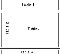
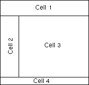 Imagine you use one table to get a design like the illustration to the right here, using
colspan as appropriate. It works nice, but maybe you would like something more advanced, that
you need to use more tables for. You may have a table inside a cell, but maybe there's a better
way to do things? If you have everything inside one table, then many browsers will wait
until verything is loaded before the page is shown. If you have a quick-loading page, probably
without lot of pictures, this may not be such a big problem. It's worse if there's much to
render (show) on the page, in that case a solution with several tables may be preferred.
Imagine you use one table to get a design like the illustration to the right here, using
colspan as appropriate. It works nice, but maybe you would like something more advanced, that
you need to use more tables for. You may have a table inside a cell, but maybe there's a better
way to do things? If you have everything inside one table, then many browsers will wait
until verything is loaded before the page is shown. If you have a quick-loading page, probably
without lot of pictures, this may not be such a big problem. It's worse if there's much to
render (show) on the page, in that case a solution with several tables may be preferred.
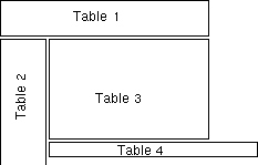
This illustration shows a way to achieve the same design with tables, and it means that
you don't have to wait until everything is loaded before something is shown. The first table at
the top will show its content while the rest is being loaded, keeping the interest of the
visitor. There is also a trap to go in, if you're not careful.
With the first design using one table, you may want to set the width to 95%, and set the width of cell 2 to say, 125 pixels. This may give a neat, good looking design no matter what the size of the browser-window. Do you want to try the same trick with the tables? Let's see what happens if we use a browser-window 1000 pixels wide (for the sake of easy numbers.)
You set the width of table 1 to 95% - this translates to 950 pixels in our example. Table 2 should be 150 pixels wide, and so we set table 3 to 80% - 800 pixels. 150 + 800 = 950, the same width as table 1, and it's looking nice. The last table is the same size as the first. All in all, a successful design. That is - with a 1000 pixels wide window, but what happens if we have half the size?
95% of 500 pixels equals 475 pixels. This is the width of table 1 and 4. Table 2 is still
150 pixels wide, which leaves 350 pixels next to it. If the browser use the window-width to
calculate its 80% space, it arrives at 400 pixels, but that leaves us with too little space
in the window; 150 + 400 pixels is 550 - 50 pixels wider than the window. We may have to
scroll sideways. If the browser use the reminding place, 350 pixels, to calculate the width
of the table we get 80% of 350 = 280. 150 + 280 = 430 - this is considerably less than the
tables at the top or bottom. (In the latter case, the numbers for the 1000 pixel wide window
must be corrected, but it gives similar results.)
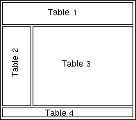
 You get similar behaviour if the browserwindow is wider than in the original design,
with the tables getting wider and therefore shorter than intended. Difference in font-settings
etc. for various visitors may also give unexpected results. If table 3 is shorter than table 2,
then the bottom table may be placed next to it as shown in the figure to the right. This may
be remedied with a simple <br clear="all"> after table 3, but one thing it does
show is that tables may not be simple to use in design always.
You get similar behaviour if the browserwindow is wider than in the original design,
with the tables getting wider and therefore shorter than intended. Difference in font-settings
etc. for various visitors may also give unexpected results. If table 3 is shorter than table 2,
then the bottom table may be placed next to it as shown in the figure to the right. This may
be remedied with a simple <br clear="all"> after table 3, but one thing it does
show is that tables may not be simple to use in design always.
How should we avoid the problems? What is shown over is the result of mixing percent and
pixel widths, and this gives variable results depending on the size of the browserwindow.
The logical conclusion would be to either use only pixel sizes, or only percent sizes - but
this may not produce the wanted results after all: If you use pixel sizes, the design won't
adapt to the window-width. If you have a larger window than the designer of the pages, you
will get large, empty spaces. Similar with smaller window than the designer, then you have
to scroll sideways to read. This is very annoying, and therefore often considered a big "no-no"
in design (especially among those who know the possibilities and limitations of
web-based publishing.)
 A pure percent-based design will adapt to the browser window, but may yeld unwanted results:
One table may become too wide for the content to be presented neatly, or too narrow for the
content to be read easily. A combination of percent and pixel sized tables should be possible,
but how should it be done?
A pure percent-based design will adapt to the browser window, but may yeld unwanted results:
One table may become too wide for the content to be presented neatly, or too narrow for the
content to be read easily. A combination of percent and pixel sized tables should be possible,
but how should it be done?
If you put the whole design within one table with one single cell, you may not set the width
for all the tables inside it, just let them fill out the space within the boundaries of the
surrounding table. That way you may mix percent and pixels without worrying about the right edge
of the design, but there's one problem: It's very like the first example, with one table and
many cells, each which may contain another table. And like that example, everything has to be
loaded before you can see anything on the screen (in many browsers.) What you gained by using
many different tables are therefore lost again just as quick.
 All is not lost, however. The problem (usually) arises when there are tables aligned next to each
other, so why not combine tables with this in mind? Table 1 poses no problem, as it is by itself
on the top. Table 2 and 3 are next to each other, so we put this inside another table which has
the same with in percent as table 1. Table 2 has its width specified in pixels, and table 3
occupy the rst of the space inside it. At the bottom table 4 has it's place nicely.
All is not lost, however. The problem (usually) arises when there are tables aligned next to each
other, so why not combine tables with this in mind? Table 1 poses no problem, as it is by itself
on the top. Table 2 and 3 are next to each other, so we put this inside another table which has
the same with in percent as table 1. Table 2 has its width specified in pixels, and table 3
occupy the rst of the space inside it. At the bottom table 4 has it's place nicely.
With this approach, the content in table 1 can be shown while table 2 and 3 is being loaded.
When these two are being shown, tha last table are loaded and rendered. As you're showing parts
of the page faster, chances that visitors wait a bit more and read your pages increases, as they
get something to see/read while waiting for the rest of the page to load. To further help the
speed, it is very important to specify width and height of pictures.
Be the first to write a comment